Contrast
>> Wednesday, June 29, 2011
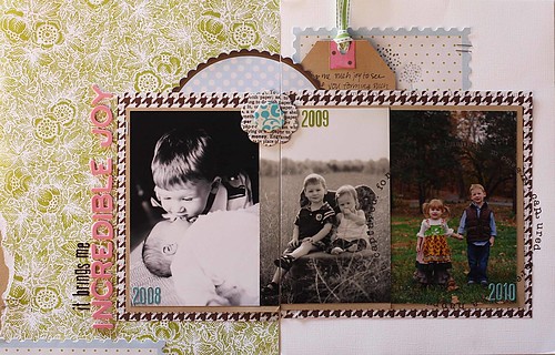
Lately I have enjoyed approaching layouts with the focus of "contrast" as I brainstorm my layout topic, journaling, and the overall design.

Lily Bee Products used
Picket Fence: Cottage Garden, ABC Alphas
Three Little Birds: Just Relax, Die cut frames, Accent Rub Ons
Lovely: Charm, Chipboard Stickers
So often I document the who, what, when, where, and why-- these are some of my favorite pages and memories. But I love to challenge myself and think deeper in terms of topics and journaling.

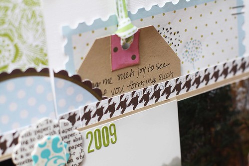
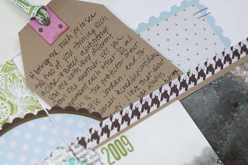
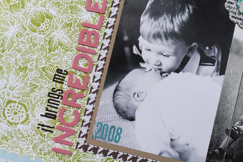
For instance, this page above does not really have a who, what, when, where, "story"; however the story I am telling has to do with my children and their relationships as siblings. I use contrast by showing and comparing visual differences of each year's photos (it's crazy how much they change in a few short years!). I also used "contrast" as a journaling prompt to share how although very different, their strengths bring out the best in one another.

As I was designing this layout, I decided to keep it simple and continue with the theme of contrast. I used one white cardstock page and one pattern paper page and connected the photos across the layout. By using two black and white photos, and one color photo, there was visual contrast and the most recent photo is highlighted in color.

The wonderful thing about Lily Bee is that so many collections bring out the best in one another! I used three different collections in this layout (Picket Fence, Three Little Birds, and Lovely).
I hope this inspires you to think outside the box next time you sit down to create a layout. Look for ways to contrast photos and design-- and of course don't forget to reach for Lily Bee!


5 comments:
Stunning! I love how it has the patterned paper on one side and cardstock on the other.
gorgeous jenni and love how you combined the collections together :)
So pretty Jenni! Just love this page.
This is so beautiful Jenni!
I just love everything about this layout!
Post a Comment