a different perspective.
>> Monday, December 7, 2009
Hey everyone!! We thought we would do something a bit different and post our own favorite Lily Bee layouts we've done this past year...with an explanation of why we love it. It's always interesting (we think!) to hear about a layout from the creator's perspective.
Check back soon for a twist on this post, Kristen (our owner), will post her favorites!!
from Stephanie...
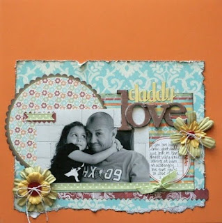
this one just makes me smile...it reminds me of such a special time in my life and i just adore this layout. (i have to agree...that photo is darling!!) from Nicole...
this photo of my husband and daughter speaks volumes about their relationship...they can read each other's minds, i swear it!! add to that the fact that they often seem to be in cahoots, and it's a definite favorite.
from Lori:
I was able to journal the full story of how I met my husband and I treasure it because I know my children will when they are older. (awesome idea to get your 'story' down for your kids...love this idea, Lori.)
I like this layout first because it’s a vacation layout which I almost NEVER do - so it's priceless to me that I documented part of our trip - and second - the colors in the Audrey line are not a 'typical' color scheme - I love that it can be used on everything from vacations to holidays and everything in between! (definitely agree Brenda...vacation photos often go unscrapped, so this is great!)
 I think the thing that is clear with all of these choices is that they all focus on the story...whether through photos or our words, these each strike a chord in our hearts.


7 comments:
Love these pages! How sweet to read the stories behind them!
This was fun! I loved learning about the los and why they are so special to the designer. Great idea! And those los are all so divine!
Hello gorgeousness!!!
Beautiful LOs & all the photos are lovely. I really enjoyed reading the stories behind the LOs, thanks for sharing them :)
wow... love all the pages and thanks for sharing your side of the stories :)
I can see why these are favorites. Great Layouts
love all of these!
Post a Comment