Thoughts on Journaling
>> Tuesday, October 18, 2011
I have to admit, I often leave my journaling last when creating a layout. That doesn't mean I don't like journaling (i love it) or that i don't have much to say (i usually have too much to say), but when it comes to design, it can be hard to determine where and how much to write.

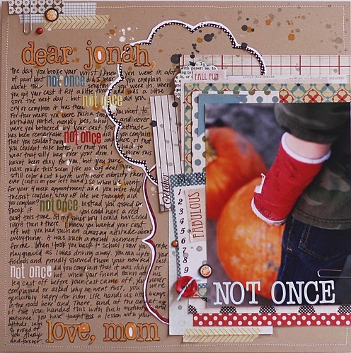
My son recently broke his wrist at school and the story I wanted to remember was not the where and how, but really, how he responded to this little trial in his life. For a five year old, his attitude was truly remarkable. So I decided to layer my photo and embellishments on one side of the page, and leave the rest of the page for my journaling.

I wrote him a letter and incorporated ABC stickers from the Harvest Market Collection within my journaling. It helps the eye not get "lost" among all those words. I also created some of my own embellishments by trimming the Die Cut Frames from the Christmas Town Collection! Layering the frames between the photo/embellishments AND journaling allowed for everything to flow together (instead of just being side by side photo and journaling).
 Don't be afraid to spend some time (and page space) and write out your thoughts! You really can have BOTH words and products in one page!!
Lily Bee Products Used:
Harvest Market- Peach Crisp, Black Licorice, Hayride, Squash, Harvest Blue, ABC stickers, Mixed Cardstock Stickers, Index Journaling Cards.
Memorandum- Boardroom, Whiteboard, ABC stickers
Christmas Town- Die Cut Frames


10 comments:
This layout is fantastic!
This is AMAZING and loveeeeeeeeee that you documented this!! Great job on the journaling! :):):):):):):):):):):)
I am so jealous of the journaling on this one... I'm a chicken when it comes to journaling directly on my page. I love the layout!!
So incredible, Jenni! Love the way you did the journaling, and those layers!
Fantastic layout - love love love all of the layers
I love this layout Jenni! My son broke his arm when he was 2...we don't know how or when even...crazy boys! He's 10 and I still haven't documented it. This is an awesome inspiration!
Beautiful page! Love the journaling as a design element!
This is a great example of really meaningful journaling. I love how you repeated the same phrase in different colored alphabet stickers--it adds both rhythm and variety to the block of journaling.
Shut up. That is freaking amazing. Jenni, I love love love this layout!
My take on the sketch!!! Lots of fun!!!
http://teenabugg.blogspot.com/2011/10/lily-bee-sketch-challenge-2.html
thanks for looking!
Post a Comment